Amazon Alexa App
The Amazon Echo, or "Alexa", is a hands-free, voice-controlled device that plays music, controls smart home devices, provides information, reads the news, sets alarms—and is always getting smarter. I created this app redesign as a personal project. As an Amazon Echo user, I noticed a need in the mobile experience.
ROLE —
UI Design, User Research, & Visual Design
CLIENT —
Personal Project

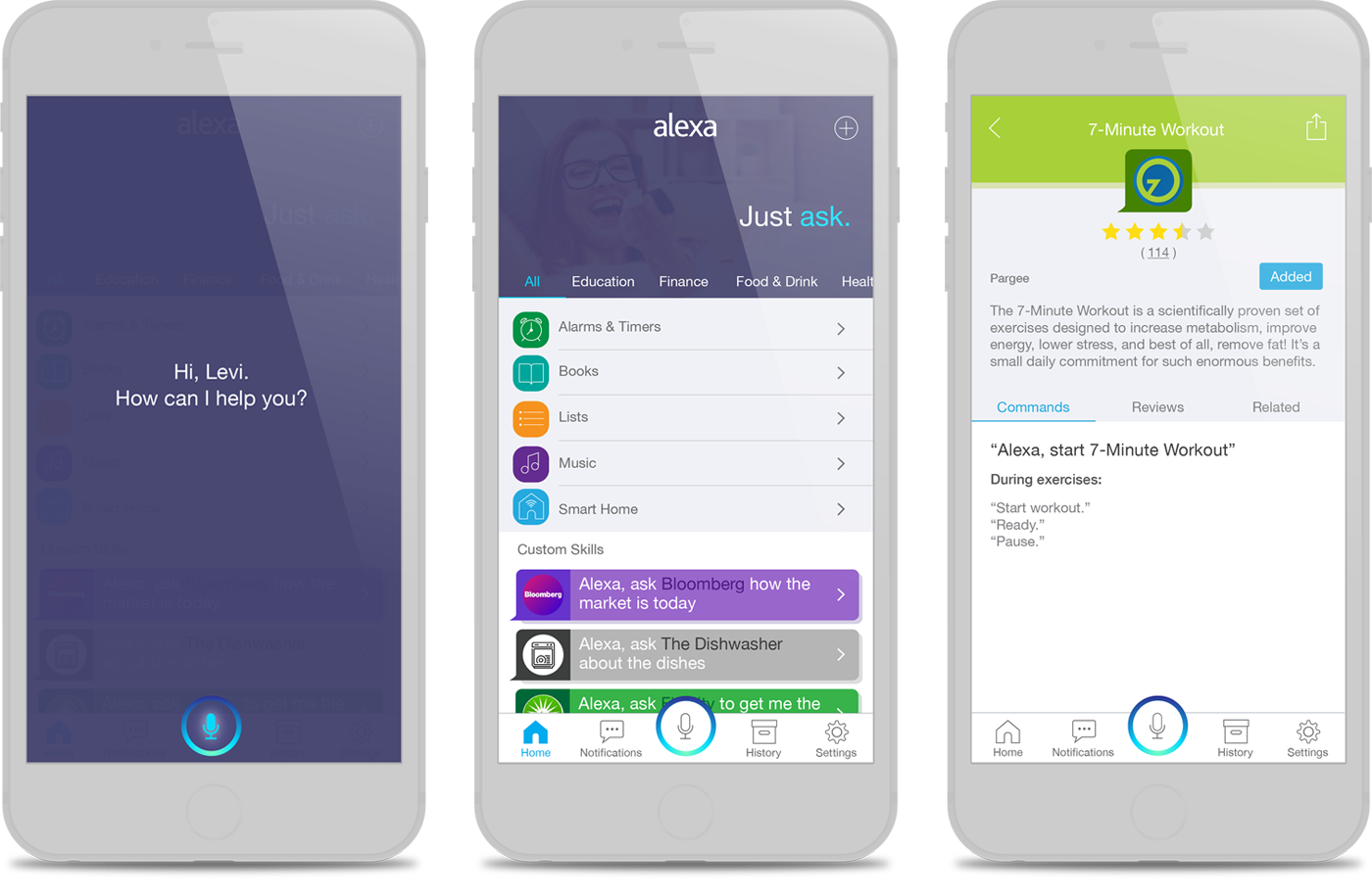
Mobile Experience
The Echo was designed to build a voice command ecosystem that could integrate into the user's lifestyle. Unfortunately, I observed that the product wasn't providing me, or other users, with a consistent experience across all touchpoints of the Echo journey. For example, Alexa does not have a voice interface on the phone like she does on the tower. Additionally, adding functionality to Alexa through the 'skills' feature is not immediately discoverable in the app, but provides one of the product's biggest strengths.
These deficiences cause negative sentiment and a lack of adoption of the built-in features and the third-party skills library. My vision is that by emphasizing new skill discovery within the app and pushing relevant information to the user, the Amazon Echo will stand apart from other products in the market and help the user achieve a better total experience.


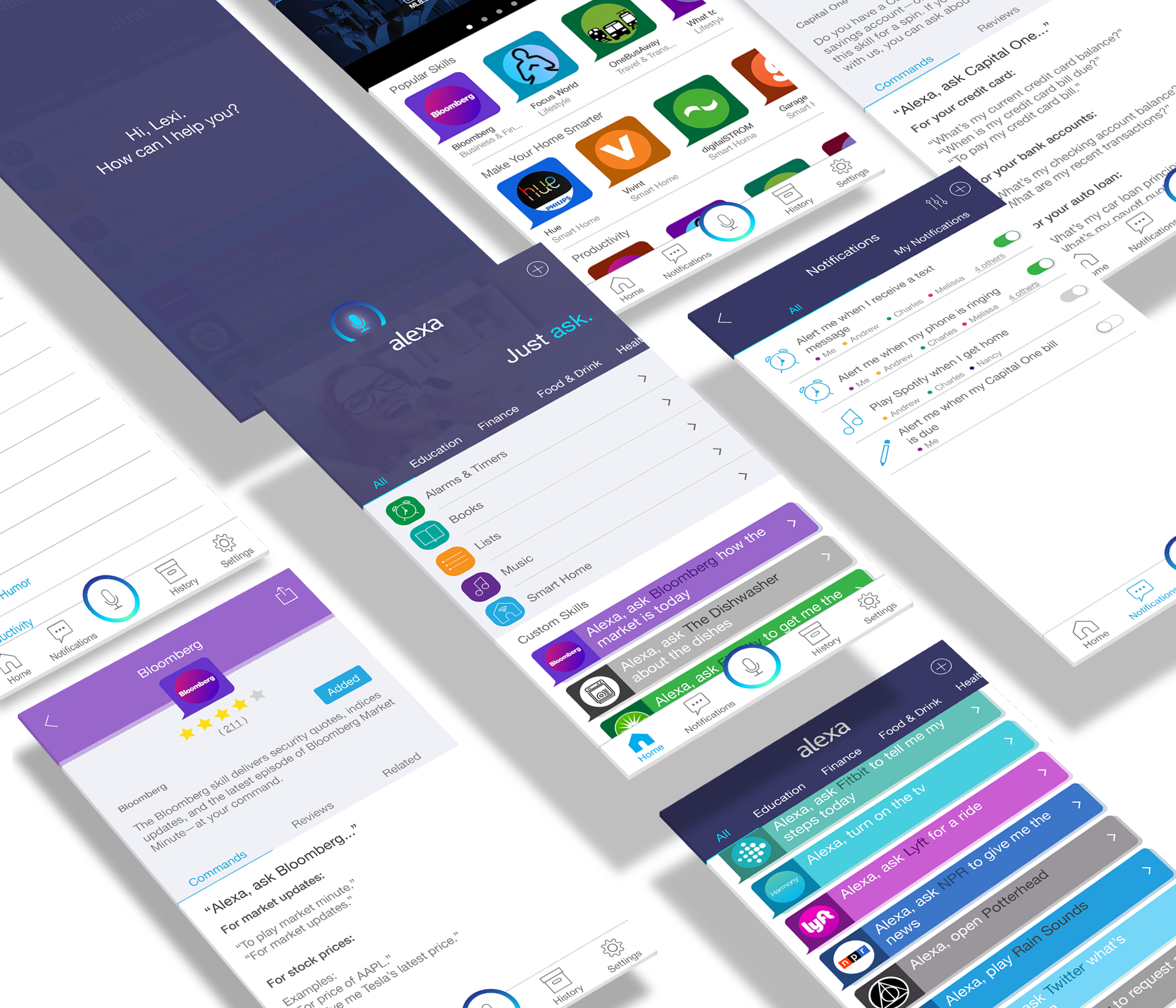


Redesign Goals
1. Voice Interface
By bringing voice interface to the app, we would be creating a seamless experience between the Echo tower and the Echo app —allowing you to talk with Alexa wherever you are.
Voice is powerful, and as you use Alexa you begin to learn her language. Why adapt to a whole new paradigm when using your mobile device?

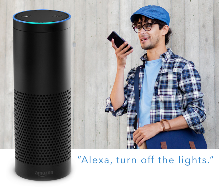
2. Emphasize Skills
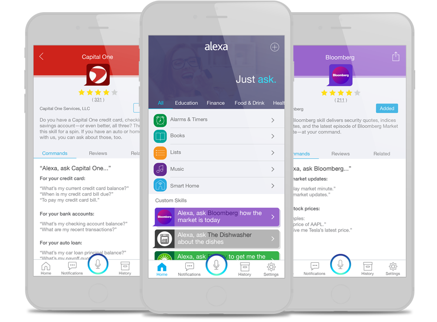
The Amazon Echo is the only one of its class with a fully open development platform. By bringing skills to the forefront of the mobile app, we promote Alexa's status as not only a technology product, but a voice-command ecosystem.

Target Audience
In this redesign, I am targeting all current Amazon Echo users that would like to get more out of the Alexa experience, and early adopters interested in the customization of Alexa skills.
Existing UI
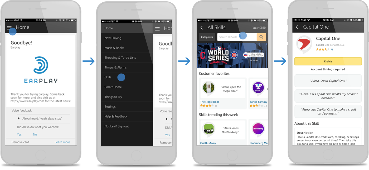
In the existing UI, opening the app takes you to the home screen with the history of your communication with Alexa. To view the skills you have added to Alexa, or to add additional skills, you need to tap the hamburger menu in the top left, and then tap Skills — 6 rows down. This design buries the skills section, and hides a key feature of the Echo. Additionally, there is no way for you to talk with Alexa in the app.

Initial Redesign
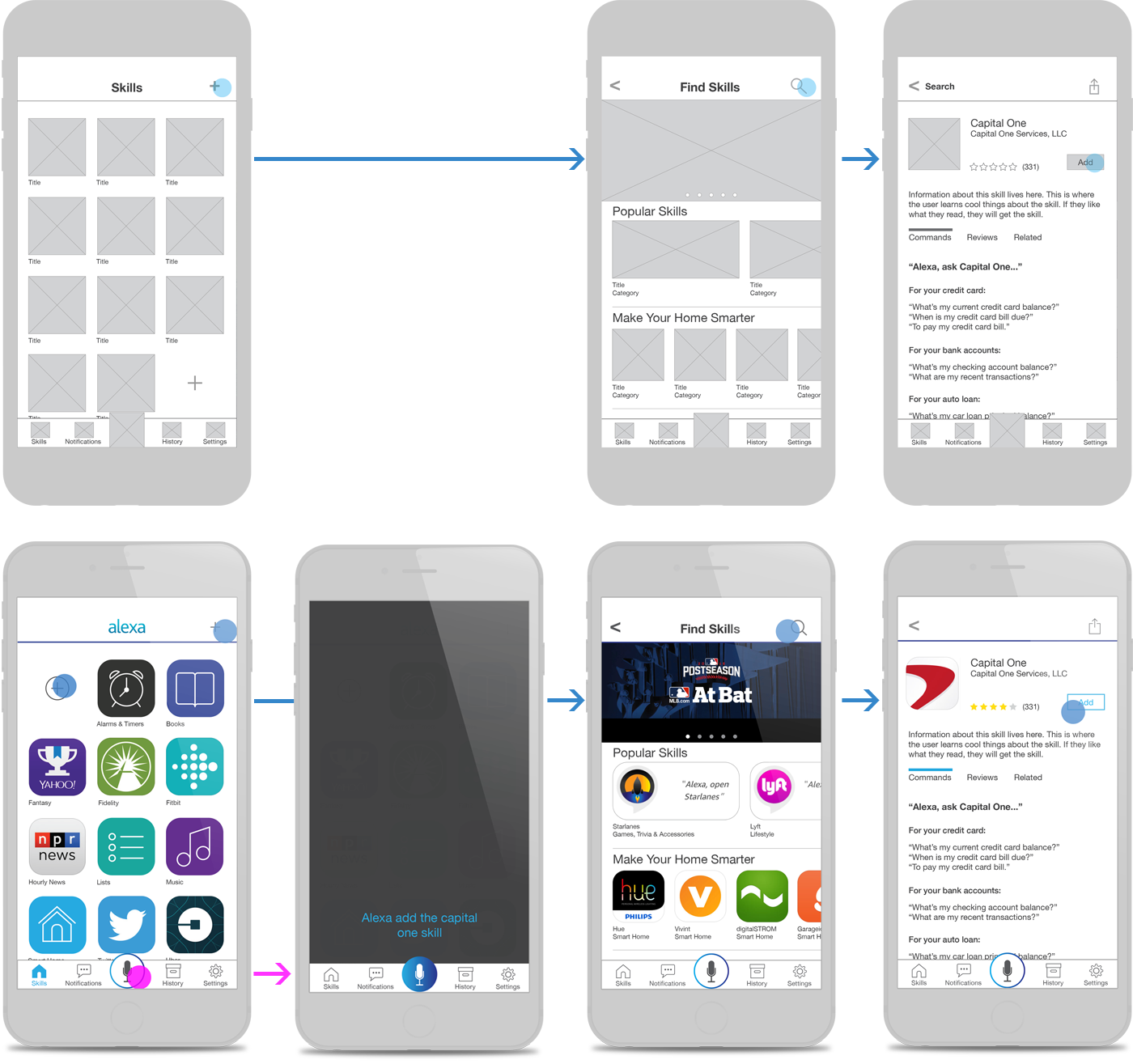
These early wireframes rely heavily on the app store metaphor. Built-in features and custom skills appear on the initial screen when opening the app, and there is a button to press to talk with Alexa. I removed the hamburger menu, and created a bottom navigation bar. This design allows you to easily scan and select what you are looking to do. It also encourages users to add more skills and take advantage of Alexa's built-in features.

User Tests
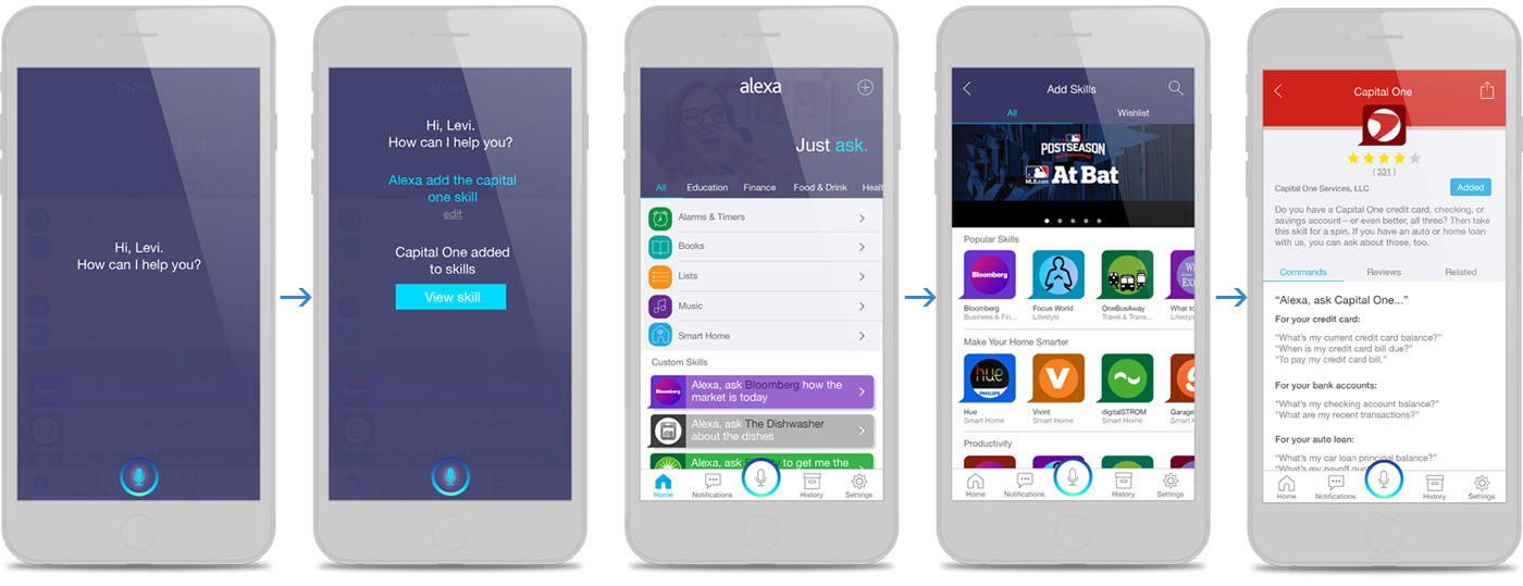
I took my redesign to 12 users: 6 current Alexa users and 6 non-Alexa users. This was done to gauge the immediate usabilty of the new design for beginners and experienced users. My user research gave me valuable insight for my next redesign. First, I learned that people wanted more out of the push-to-talk functionality. This was a big impetus for emphasizing this feature, even making it the very first screen when opening the app. Second, though the app store metaphor was powerful, it was confusing. People expected skills to function as fully-fledged apps on the phone. This led to a redesign of the skills area with a much more customized look and feel. Finally, I learned that the emphasis on built-in Alexa features makes the custom skills less discoverable. This led me away from a home screen with equal emphasis on the two types, and towards a linear design for better scanability and a focus on custom skills.
"I like that I can talk to Alexa in the app. That's how I communicate with her at home, and it's how I want to talk with her in the app."
- User Test Insight
FINAL REDESIGN

NEXT UP
2015 Desk Reference
Art Direction, Print Design, UI Design
